На сайте используются cookie файлы
The site uses cookie files
Данный сайт имеет возрастное ограничение!
This site has age restrictions!
Я подтверждаю, что мне, увы, уже давно исполнилось 18 лет
When the wine industry steps onto its own red carpet – from the language of design to the fashion of labels.
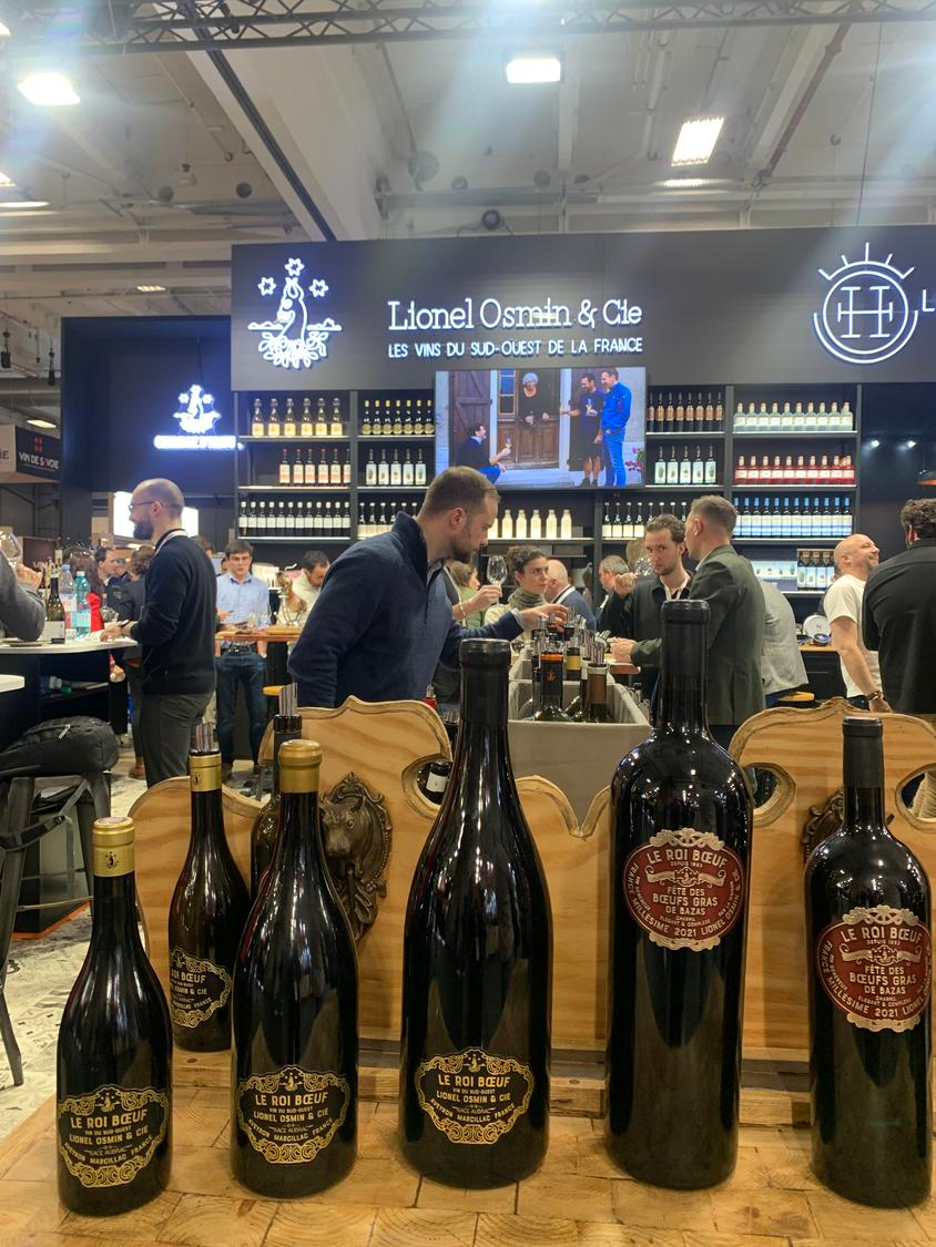
Wine Paris 2026 – one of the world’s largest exhibitions dedicated to wine and spirits – took place in the French capital from 9 to 11 February, as previously reported by D+. This year, Paris set new records of its own: more than 6,500 exhibitors from over 60 countries and around 63,500 trade visitors representing 169 nations. That is roughly 20% more than the previous year, placing the Paris fair firmly on the top step of the podium among global wine-industry events.
Yet Paris, as the world’s fashion capital, invites a broader reading of Wine Paris 2026 – not merely through statistics or production trends, nor solely as a venue for tastings and professional meetings. The city’s irresistible “red carpet” lies in its label aesthetics, graphic language and winery branding – all of which reflect the most current currents shaping the wine world. France has long cultivated a tradition of showcasing new approaches to wine design, and Vinexpo Bordeaux – whose legacy Wine Paris now carries – served for decades as the leading international stage for unveiling premium visual identities. It was there that many producers first introduced refreshed labels, new graphic concepts and reimagined brand identities.
Today, Wine Paris performs this role with remarkable finesse. After all, design shapes the very first impression of a wine – and there is no second chance to make it. A close look at the visual solutions presented at Wine Paris reveals how the contemporary language (and fashion) of wine is evolving, and which aesthetic approaches now dominate the industry’s runway.
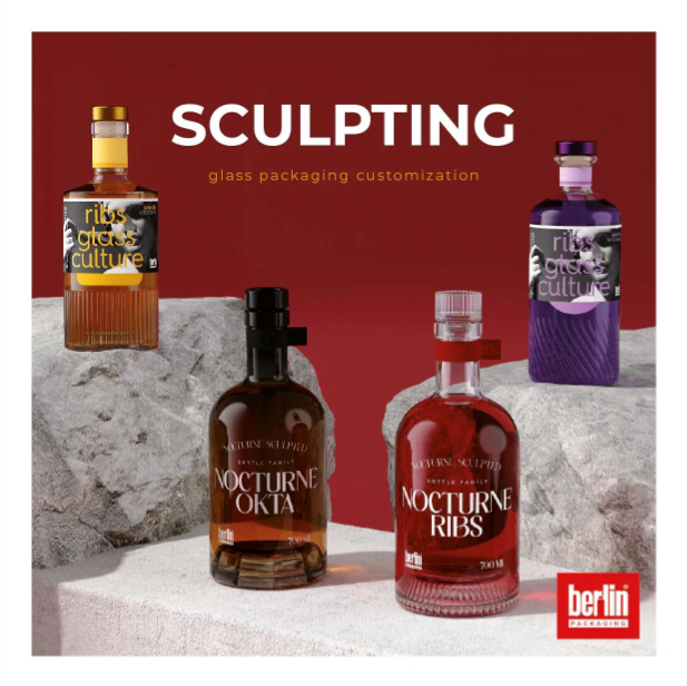
This year, Wine Paris resembled a complex ecosystem in which wine interacted with architecture, graphic design and emerging cultural consumption trends. Stands functioned as complete visual narratives, while labels acted as messages within a broader design vocabulary. One of the most illustrative examples of this “wine fashion” approach came from Berlin Packaging, a global group uniting leading producers of packaging and premium glass. In Paris, the company presented its “Sculpting” concept – a design philosophy for bottle creation that blends aesthetics, texture and functionality to enhance a brand’s premium positioning. Notably, alongside classic wine categories, the no-alcohol sector asserted its own visual language and style with growing confidence.
One of the most striking trends at Wine Paris 2026 was the rise of conceptual, design-driven stands that expressed the architecture of a brand. Many producers moved away from the traditional “bar + bottle shelves” format in favour of spaces that conveyed the winemaker’s philosophy.
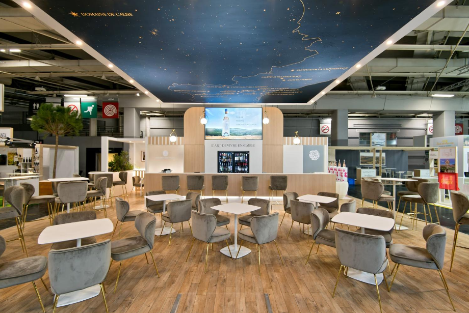
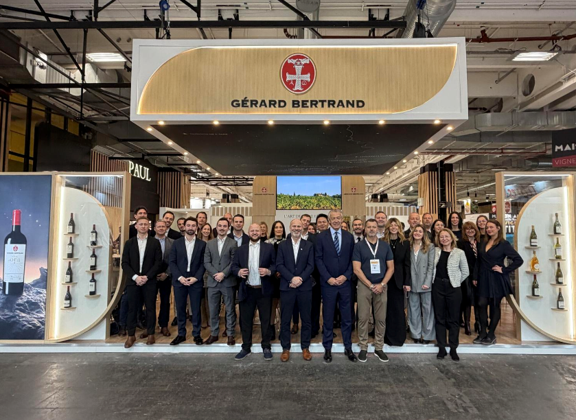
A strong example came from Gérard Bertrand, one of Languedoc’s most renowned producers. The stand embraced a natural aesthetic with light wood, greenery and soft lighting – a subtle nod to the estate’s biodynamic principles.
A similar approach was increasingly visible among regional consortia. Their stands were designed to merge tasting, education and informal conversation while simultaneously making a stylistic statement. The German Pavilion, for instance, offered a concise, structured space where 68 producers were united under a single visual identity. Rather than separate stands, it formed one cohesive narrative, with each participant integrated into a clear graphic system.
Many exhibitors opted for suspended logos for visibility, open-access tasting counters, and clearly defined functional zones (tasting, presentation, meeting areas). Some stands featured dynamic corners with short presentations, winemaking videos or mobile tasting stations, helping visitors engage with the wines even without lengthy conversations.
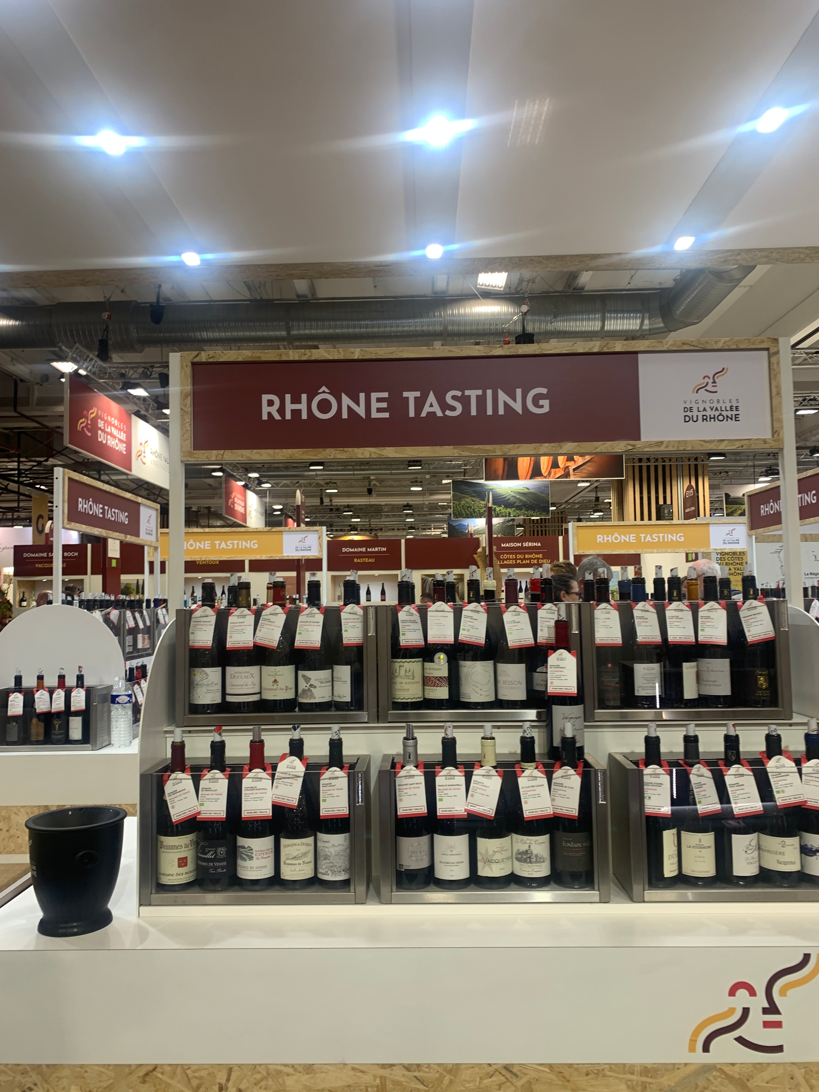
Another notable trend was the expansion of large free-tasting zones. Clearly labelled by region and supported by QR codes, these areas allowed visitors to explore wines at their own pace – whether Champagne or Languedoc. This format enabled efficient navigation through vast product ranges, discovery of new regions and more deliberate tasting, saving producers’ time while allowing deeper engagement with wines that captured attention.
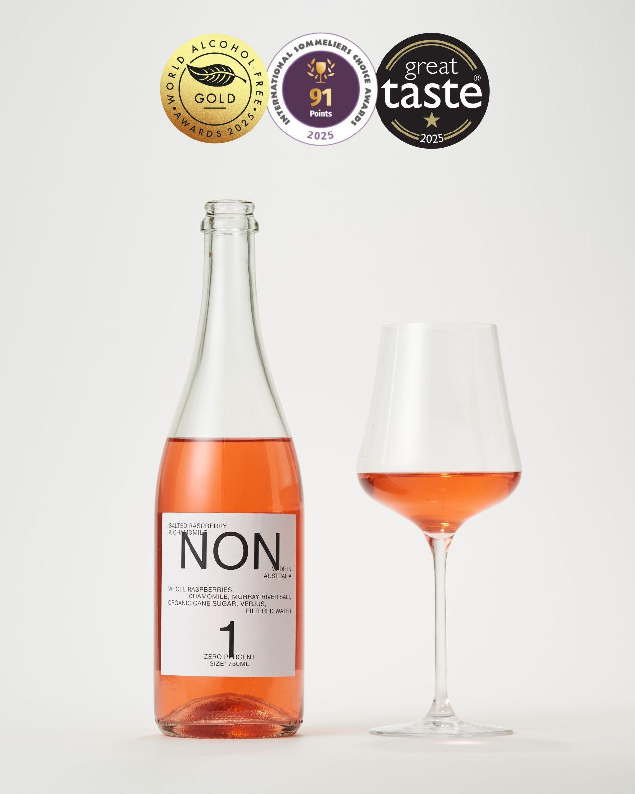
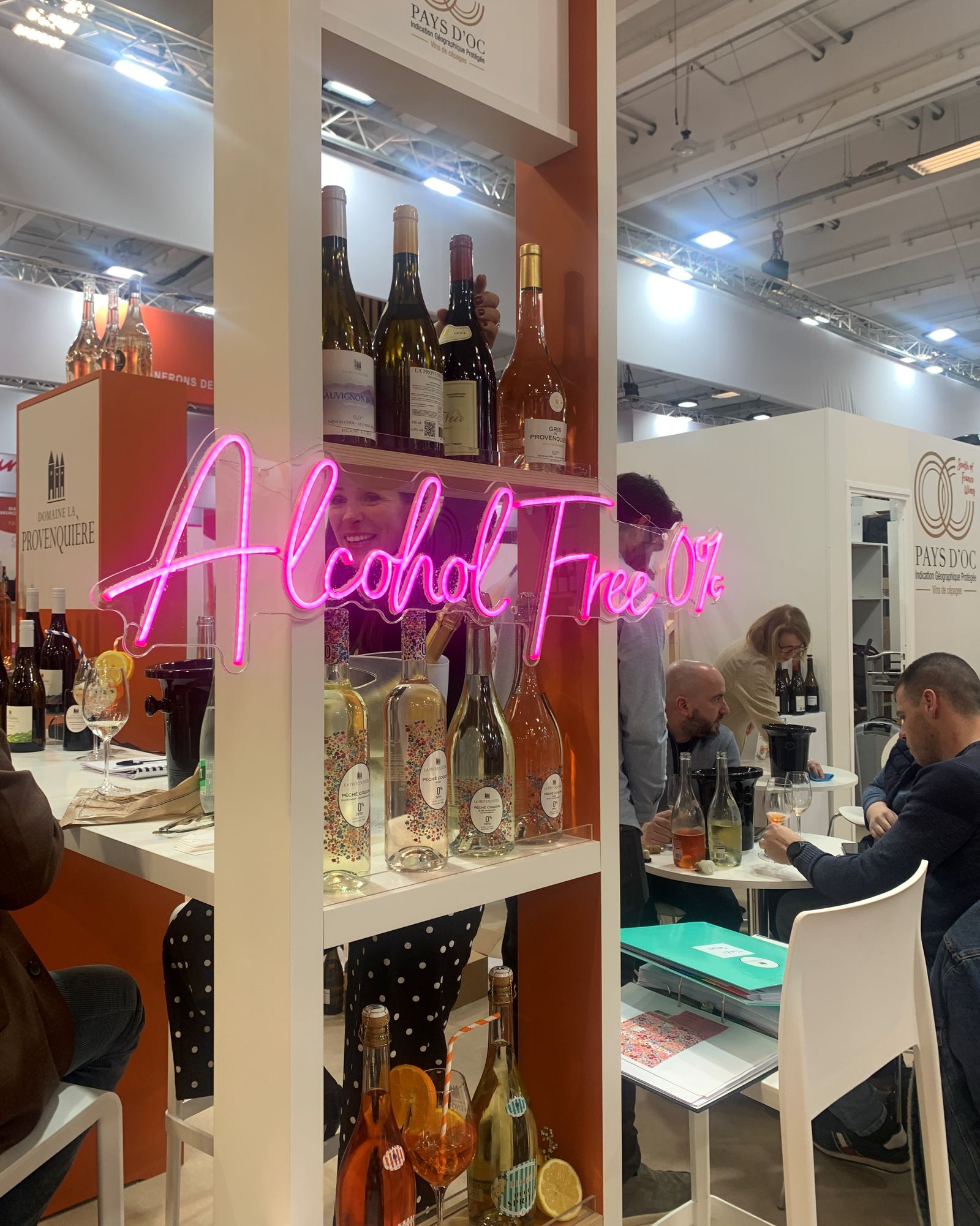
One of the most talked-about areas of the fair was Be No – a space dedicated to no-alcohol and dealcoholised beverages. The no-alcohol wine category is stepping confidently into the industry’s “final pose spot”, driven not only by the product itself but by its visual identity. This is hardly surprising: the No&Low segment attracts some of the most progressive and daring producers, whose appetite for experimentation is reflected in bold bottle shapes, striking typography and innovative graphic solutions.
Hundreds of products were showcased – from no-alcohol wines to intricate botanical blends crafted for gastronomic pairings.
French Bloom, for example, presented its sparkling no-alcohol wines in “little black dress” bottles – matte black with minimalist gold typography, evoking the aesthetics of perfumery or luxury cosmetics.
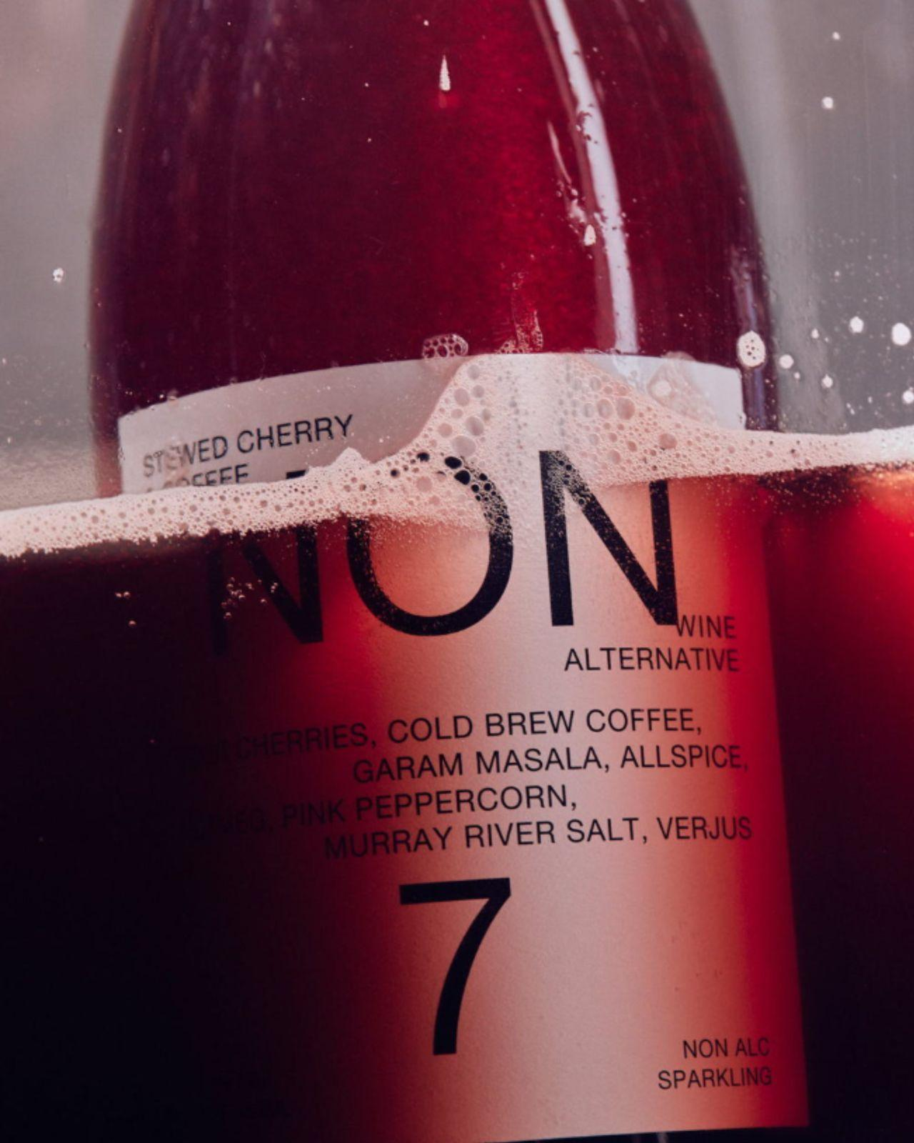
Australian brand NON, known for its gastronomic no-alcohol beverages designed for restaurant pairings, embraced a deliberately restrained design: minimalist numbers instead of names and almost no decorative elements. The brand positions itself not as a wine substitute but as a standalone gastronomic category.
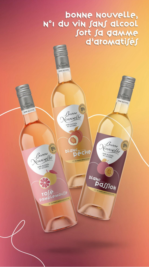
Meanwhile, the French brand Bonne Nouvelle introduced a series of no-alcohol flavoured wines with vibrant fruit-forward labels aimed at younger consumers and new drinking occasions such as Dry January or casual gatherings.
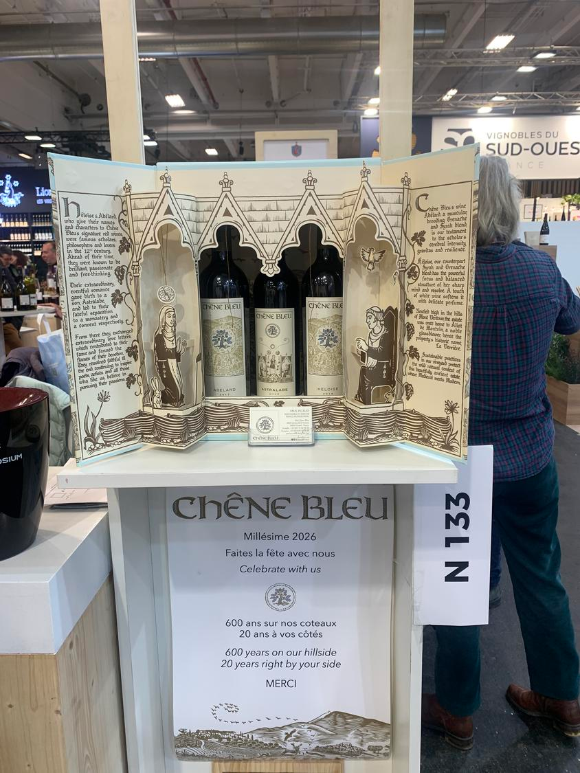
Alongside stand architecture, wine labels themselves are undergoing visible evolution. At Wine Paris 2026, designs increasingly reflected contemporary graphic principles: minimalism, bold typography, symbolic or artistic illustration. Labels are no longer mere conveyors of appellation or variety. They have become the first point of contact between wine and consumer – the cover of the story a brand wishes to tell. Whispering Angel rosé, for instance, became globally recognisable thanks to its ultra-minimalist label and transparent bottle, shaping the aesthetic of an entire category.
Another shift stems from the need for labels to perform not only on the shelf but also in the digital space. Complex crests or fine decorative details often disappear on smartphone screens, whereas strong graphics, clear typography and vivid colours remain instantly recognisable even at small scale. This is why many contemporary brands are moving toward more minimalistic, graphic-forward solutions – equally effective in-store and on Instagram.
Maison Cantarelle from Provence exemplifies this trend with bold, bright, graphic labels that function as miniature art pieces, reflecting the wines’ light, open character.
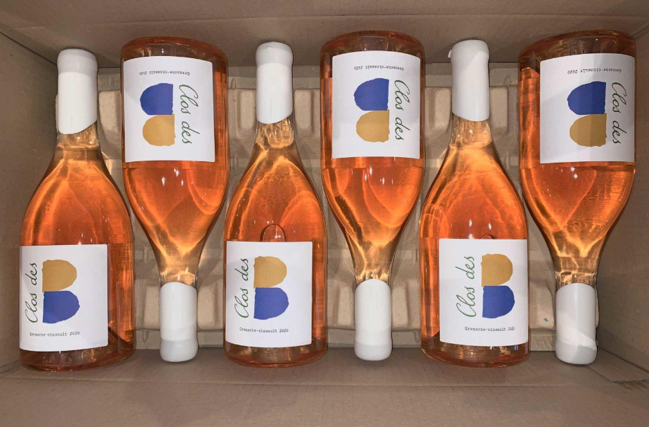
Clos des B, also from Provence, takes the opposite route: minimalism and restraint, simple forms, a two-colour palette and a front label listing the varietal composition.
Many modern labels draw on cultural or geographic symbols – architecture, landscapes or iconic imagery. Australian producers often use native fauna to create immediate associations with origin, functioning as visual mnemonics that help consumers quickly identify style. Strelley Farm Estate, for example, highlights its rosé pét-nat with exotic motifs.

Other brands turn to specific cultural aesthetics. Bento, designed by the Denomination agency, incorporates elements of Japanese visual culture: vertical typography reminiscent of traditional scripts, gently humorous character illustrations and red accents inspired by vermilion seals.
Wine Paris increasingly reflects the rapid transformation of the wine world. Today, a wine’s story begins long before it reaches the glass – it begins in the space where that story is presented. Wine Paris 2026 confirmed that design has become a central component of the industry’s language. It shapes first impressions, signals premium positioning and opens new pathways for audience engagement. It even targets specific consumer generations.
Ultimately, wine now speaks not only through taste but through form, colour, graphics and space – creating a new visual language in which design becomes an integral part of the experience.
⇒ Join our social networks ⇒ Optimistic D+ editors will take this as a compliment.
⇒ Every like is taken as a toast!
08.04.2026
23.03.2026
